Theme Your Importer
You can customize your importer by two ways
1. From frontend (highest priority)
a. Customize your importer by passing the theme option from frontend
// usage example in vanilla JavaScript
var importButton = document.getElementById("import-data-button");
importButton.onclick = function () {
  useCsvPlugin({
    importerKey: "your-importer-key",
    theme: {
      global: {
        backgroundColor: "#212327",
        primaryTextColor: "#c2c3c3",
        secondaryTextColor: "#ffffff",
        successColor: "#c2c3c3",
        warningColor: "#c2c3c3",
        outerPadding: "true" // "true" | "false"
      },
      buttons: {
        primary: {
          backgroundColor: "#00D1AF",
          color: "#002d3d",
          border: "1px solid transparent",
          borderRadius: "1px",
          boxShadow: "0 1px 3px 0 rgba(0, 0, 0, 0.1), 0 1px 2px 0 rgba(0, 0, 0, 0.06)",
          ":hover": {
            backgroundColor: "#00D1AF",
            color: "#002d3d"
          },
          fontSize: "0.875rem",
          fontWeight: "600",
          fontStyle: "normal",
        },
        secondary: {
          backgroundColor: "#d9ccff",
          border: "1px solid #ece6ff",
          color: "#002d3d",
          borderRadius: "1px",
          boxShadow: "0 1px 3px 0 rgba(0, 0, 0, 0.1), 0 1px 2px 0 rgba(0, 0, 0, 0.06)",
          ":hover": {
            backgroundColor: "#794cff",
            color: "#c2c3c3"
          },
          fontSize: "0.875rem",
          fontWeight: "600",
          fontStyle: "normal",
        },
        tertiary: {
          backgroundColor: "#FFFFFF",
          border: "1px solid #3182CE",
          color: "#3182CE",
          borderRadius: "1px",
          boxShadow: "0 1px 3px 0 rgba(0, 0, 0, 0.1), 0 1px 2px 0 rgba(0, 0, 0, 0.06)",
          ":hover": {
            backgroundColor: "#F0FFF4",
            color: "#3182CE"
          },
          fontSize: "0.875rem",
          fontWeight: "600",
          fontStyle: "normal",
        }
      },
      steps: {
        backgroundColor: "#FFFFFF",
        activeBackgroundColor: "#FFFFFF",
        completedBackgroundColor: "#3182CE",
        color: "#718096",
        activeColor: "#3182CE",
        completedColor: "#FFFFFF",
        borderColor: "#E2E8F0",
        activeBorderColor: "#3182CE",
        completedBorderColor: "#3182CE",
        connectorColor: "#E2E8F0",
        titleColor: "#171923",
      },
      cells: {
        error: {
          color: "#F43F5E",
          backgroundColor: "#FFEEEE",
        },
        info: {
          color: "#3f45f4",
          backgroundColor: "#EEF6FF",
        },
        healing: {
          color: "#ED8936",
          backgroundColor: "#FFFAF0"
        },
      },
      tables: {
        headerColor: "#2D3748",
        headerBackgroundColor: "#F7FAFC",
        headerTextTransform: "uppercase", // "uppercase", "lowsercase", "capitalize", "none"
        borderColor: "#E2E8F0",
        color: "#4A5568",
      },
      modals: {
        backgroundColor: "#FFFFFF",
        color: "#1A202C",
        border: "1px solid #11161F",
        boxShadow: "2px 2px 0px #11161F",
        buttons: {
          confirm: {
            backgroundColor: "#E53E3E",
            color: "#FFFFFF",
            border: "1px solid transparent",
            borderRadius: "1px",
            boxShadow: "0 1px 3px 0 rgba(0, 0, 0, 0.1), 0 1px 2px 0 rgba(0, 0, 0, 0.06)",
            ":hover": {
              backgroundColor: "#00D1AF",
              color: "#C53030"
            },
            fontSize: "0.875rem",
            fontWeight: "600",
            fontStyle: "normal",
          },
          cancel: {
            backgroundColor: "#EDF2F7",
            border: "1px solid #ece6ff",
            color: "#244c72",
            borderRadius: "1px",
            boxShadow: "0 1px 3px 0 rgba(0, 0, 0, 0.1), 0 1px 2px 0 rgba(0, 0, 0, 0.06)",
            ":hover": {
              backgroundColor: "#794cff",
              color: "#244c72"
            },
            fontSize: "0.875rem",
            fontWeight: "600",
            fontStyle: "normal",
          }
        }
      },
      customFont: [
        {
          fontFamily: "Montserrat",
          srcURL: "https://fonts.gstatic.com/s/montserrat/v26/JTUHjIg1_i6t8kCHKm4532VJOt5-QNFgpCtr6Hw5aXp-p7K4KLg.woff2",
          srcFormat: "woff2",
          fontWeight: 400,
          fontStyle: "normal",
          fontDisplay: "swap",
          unicodeRange:
            "U+0000-00FF, U+0131, U+0152-0153, U+02BB-02BC, U+02C6, U+02DA, U+02DC, U+0304, U+0308, U+0329, U+2000-206F, U+2074, U+20AC, U+2122, U+2191, U+2193, U+2212, U+2215, U+FEFF, U+FFFD",
        },
      // ...
      ],
    }
  });
};
2. From the importer settings in the admin panel
a. Customize your importer by editing the theme JSON object
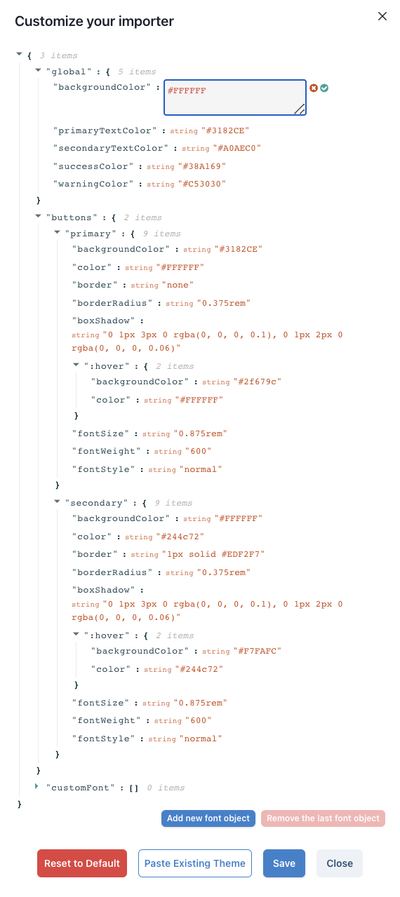
You can edit each CSS property in the Customize Theme modal, Save and check the Importer preview to view your changes.
b. Customize your importer by pasting an existing theme JSON object
In case you already have an existing theme or if you prefer to copy the default theme JSON object, edit it and paste it in the textarea input in the Customize Theme modal, Save and check the Importer preview to view your changes.
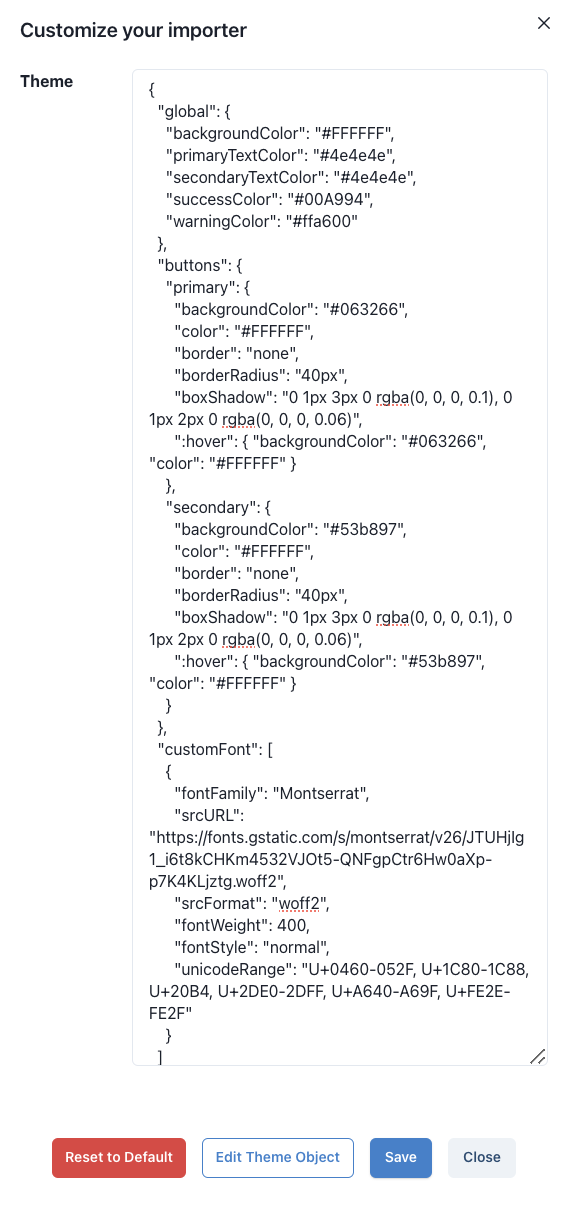
Use the same CSS properties in the default theme if you are pasting an existing theme JSON object.
Example custom theme
{
  "global": {
    "backgroundColor": "#212327",
    "primaryTextColor": "#c2c3c3",
    "secondaryTextColor": "#ffffff",
    "successColor": "#c2c3c3",
    "warningColor": "#c2c3c3",
    "outerPadding": "true" // "true" | "false"
  },
  "buttons": {
    "primary": {
      "backgroundColor": "#00D1AF",
      "color": "#002d3d",
      "border": "1px solid transparent",
      "borderRadius": "1px",
      "boxShadow": "0 1px 3px 0 rgba(0, 0, 0, 0.1), 0 1px 2px 0 rgba(0, 0, 0, 0.06)",
      ":hover": {
        "backgroundColor": "#00D1AF",
        "color": "#002d3d"
      },
      "fontSize": "0.875rem",
      "fontWeight": "600",
      "fontStyle": "normal"
    },
    "secondary": {
      "backgroundColor": "#d9ccff",
      "border": "1px solid #ece6ff",
      "color": "#002d3d",
      "borderRadius": "1px",
      "boxShadow": "0 1px 3px 0 rgba(0, 0, 0, 0.1), 0 1px 2px 0 rgba(0, 0, 0, 0.06)",
      ":hover": {
        "backgroundColor": "#794cff",
        "color": "#c2c3c3"
      },
      "fontSize": "0.875rem",
      "fontWeight": "600",
      "fontStyle": "normal"
    },
    "tertiary": {
      "backgroundColor": "#FFFFFF",
      "border": "1px solid #3182CE",
      "color": "#3182CE",
      "borderRadius": "1px",
      "boxShadow": "0 1px 3px 0 rgba(0, 0, 0, 0.1), 0 1px 2px 0 rgba(0, 0, 0, 0.06)",
      ":hover": {
        "backgroundColor": "#F0FFF4",
        "color": "#3182CE"
      },
      "fontSize": "0.875rem",
      "fontWeight": "600",
      "fontStyle": "normal"
    }
  },
  "steps": {
    "backgroundColor": "#FFFFFF",
    "activeBackgroundColor": "#FFFFFF",
    "completedBackgroundColor": "#3182CE",
    "color": "#718096",
    "activeColor": "#3182CE",
    "completedColor": "#FFFFFF",
    "borderColor": "#E2E8F0",
    "activeBorderColor": "#3182CE",
    "completedBorderColor": "#3182CE",
    "connectorColor": "#E2E8F0",
    "titleColor": "#171923"
  },
  "cells": {
    "error": {
      "color": "#F43F5E",
      "backgroundColor": "#FFEEEE"
    },
    "info": {
      "color": "#3f45f4",
      "backgroundColor": "#EEF6FF"
    },
    "healing": {
      "color": "#ED8936",
      "backgroundColor": "#FFFAF0"
    }
  },
  "tables": {
    "headerColor": "#2D3748",
    "headerBackgroundColor": "#F7FAFC",
    "headerTextTransform": "uppercase", // "uppercase", "lowsercase", "capitalize", "none"
    "borderColor": "#E2E8F0",
    "color": "#4A5568"
  }
}
CSS accepted color values are: Hexadecimal colors, RGB colors and RGBA colors.
UseCSV Default Theme
{
  "global": {
    "backgroundColor": "#FFFFFF",
    "primaryTextColor": "#3182CE",
    "secondaryTextColor": "#A0AEC0",
    "successColor": "#38A169",
    "warningColor": "#C53030",
    "outerPadding": "true" // "true" | "false"
  },
  "buttons": {
    "primary": {
      "backgroundColor": "#3182CE",
      "color": "#FFFFFF",
      "border": "none",
      "borderRadius": "0.375rem",
      "boxShadow": "0 1px 3px 0 rgba(0, 0, 0, 0.1), 0 1px 2px 0 rgba(0, 0, 0, 0.06)",
      ":hover": {
        "backgroundColor": "#2f679c",
        "color": "#FFFFFF"
      },
      "fontSize": "0.875rem",
      "fontWeight": "600",
      "fontStyle": "normal"
    },
    "secondary": {
      "backgroundColor": "#FFFFFF",
      "color": "#214464",
      "border": "1px solid #EDF2F7",
      "borderRadius": "0.375rem",
      "boxShadow": "0 1px 3px 0 rgba(0, 0, 0, 0.1), 0 1px 2px 0 rgba(0, 0, 0, 0.06)",
      ":hover": {
        "backgroundColor": "#F7FAFC",
        "color": "#214464"
      },
      "fontSize": "0.875rem",
      "fontWeight": "600",
      "fontStyle": "normal"
    },
    "tertiary": {
      "backgroundColor": "#FFFFFF",
      "border": "1px solid #3182CE",
      "color": "#3182CE",
      "borderRadius": "1px",
      "boxShadow": "0 1px 3px 0 rgba(0, 0, 0, 0.1), 0 1px 2px 0 rgba(0, 0, 0, 0.06)",
      ":hover": {
        "backgroundColor": "#F0FFF4",
        "color": "#3182CE"
      },
      "fontSize": "0.875rem",
      "fontWeight": "600",
      "fontStyle": "normal"
    }
  },
  "steps": {
    "backgroundColor": "#FFFFFF",
    "activeBackgroundColor": "#FFFFFF",
    "completedBackgroundColor": "#3182CE",
    "color": "#718096",
    "activeColor": "#3182CE",
    "completedColor": "#FFFFFF",
    "borderColor": "#E2E8F0",
    "activeBorderColor": "#3182CE",
    "completedBorderColor": "#3182CE",
    "connectorColor": "#E2E8F0",
    "titleColor": "#171923"
  },
  "cells": {
    "error": {
      "color": "#F43F5E",
      "backgroundColor": "#FFEEEE"
    },
    "info": {
      "color": "#3f45f4",
      "backgroundColor": "#EEF6FF"
    },
    "healing": {
      "color": "#ED8936",
      "backgroundColor": "#FFFAF0"
    }
  },
  "tables": {
    "headerColor": "#2D3748",
    "headerBackgroundColor": "#F7FAFC",
    "headerTextTransform": "uppercase", // "uppercase", "lowsercase", "capitalize", "none"
    "borderColor": "#E2E8F0",
    "color": "#4A5568"
  },
  "modals": {
    "backgroundColor": "#FFFFFF",
    "color": "#1A202C",
    "border": "1px solid #11161F",
    "boxShadow": "2px 2px 0px #11161F",
    "buttons": {
      "confirm": {
        "backgroundColor": "#E53E3E",
        "color": "#FFFFFF",
        "border": "1px solid transparent",
        "borderRadius": "1px",
        "boxShadow": "0 1px 3px 0 rgba(0, 0, 0, 0.1), 0 1px 2px 0 rgba(0, 0, 0, 0.06)",
        ":hover": {
          "backgroundColor": "#00D1AF",
          "color": "#C53030"
        },
        "fontSize": "0.875rem",
        "fontWeight": "600",
        "fontStyle": "normal"
      },
      "cancel": {
        "backgroundColor": "#EDF2F7",
        "border": "1px solid #ece6ff",
        "color": "#244c72",
        "borderRadius": "1px",
        "boxShadow": "0 1px 3px 0 rgba(0, 0, 0, 0.1), 0 1px 2px 0 rgba(0, 0, 0, 0.06)",
        ":hover": {
          "backgroundColor": "#794cff",
          "color": "#244c72"
        },
        "fontSize": "0.875rem",
        "fontWeight": "600",
        "fontStyle": "normal"
      }
    }
  }
}
How to set a custom font
You can add a custom font using the customFont array of objects key in your theme object.
type customFont = Array<{
  fontFamily: string;
  srcURL: string;
  srcFormat: "woff" | "woff2" | "truetype" | "opentype" | "embedded-opentype" | "svg" | "svgz" | "otf";
  fontWeight: string;
  fontStyle: string;
  fontDisplay: string;
  unicodeRange: string;
}>;
Below is an example using Google Fonts
-
Go to
https://fonts.googleapis.com/css2?family=${font-name}. -
Copy and paste the
@font-faceCSS rules into thecustomFontarray.
Example using the Montserrat font
{
  // ...
  "customFont": [
    {
      "fontFamily": "Montserrat",
      "srcURL": "https://fonts.gstatic.com/s/montserrat/v26/JTUHjIg1_i6t8kCHKm4532VJOt5-QNFgpCtr6Hw0aXp-p7K4KLjztg.woff2",
      "srcFormat": "woff2",
      "fontWeight": 400,
      "fontStyle": "normal",
      "unicodeRange": "U+0460-052F, U+1C80-1C88, U+20B4, U+2DE0-2DFF, U+A640-A69F, U+FE2E-FE2F"
    },
    {
      "fontFamily": "Montserrat",
      "srcURL": "https://fonts.gstatic.com/s/montserrat/v26/JTUHjIg1_i6t8kCHKm4532VJOt5-QNFgpCtr6Hw9aXp-p7K4KLjztg.woff2",
      "srcFormat": "woff2",
      "fontWeight": 400,
      "fontStyle": "normal",
      "unicodeRange": "U+0301, U+0400-045F, U+0490-0491, U+04B0-04B1, U+2116"
    },
    {
      "fontFamily": "Montserrat",
      "srcURL": "https://fonts.gstatic.com/s/montserrat/v26/JTUHjIg1_i6t8kCHKm4532VJOt5-QNFgpCtr6Hw2aXp-p7K4KLjztg.woff2",
      "srcFormat": "woff2",
      "fontWeight": 400,
      "fontStyle": "normal",
      "unicodeRange": "U+0102-0103, U+0110-0111, U+0128-0129, U+0168-0169, U+01A0-01A1, U+01AF-01B0, U+0300-0301, U+0303-0304, U+0308-0309, U+0323, U+0329, U+1EA0-1EF9, U+20AB"
    },
    {
      "fontFamily": "Montserrat",
      "srcURL": "https://fonts.gstatic.com/s/montserrat/v26/JTUHjIg1_i6t8kCHKm4532VJOt5-QNFgpCtr6Hw3aXp-p7K4KLjztg.woff2",
      "srcFormat": "woff2",
      "fontWeight": 400,
      "fontStyle": "normal",
      "unicodeRange": "U+0100-02AF, U+0304, U+0308, U+0329, U+1E00-1E9F, U+1EF2-1EFF, U+2020, U+20A0-20AB, U+20AD-20CF, U+2113, U+2C60-2C7F, U+A720-A7FF"
    },
    {
      "fontFamily": "Montserrat",
      "srcURL": "https://fonts.gstatic.com/s/montserrat/v26/JTUHjIg1_i6t8kCHKm4532VJOt5-QNFgpCtr6Hw5aXp-p7K4KLg.woff2",
      "srcFormat": "woff2",
      "fontWeight": 400,
      "fontStyle": "normal",
      "unicodeRange": "U+0000-00FF, U+0131, U+0152-0153, U+02BB-02BC, U+02C6, U+02DA, U+02DC, U+0304, U+0308, U+0329, U+2000-206F, U+2074, U+20AC, U+2122, U+2191, U+2193, U+2212, U+2215, U+FEFF, U+FFFD"
    }
  ]
  // ...
}
Below is an example using Adobe Fonts
-
Go to
https://use.typekit.net/${your-adobe-fonts-project-id}.css. -
Copy and paste the
@font-faceCSS rules into thecustomFontarray.
Example using the Droid Serif font
{
  // ...
  "customFont": [
    {
      "fontFamily": "droid-serif",
      "srcURL": "https://use.typekit.net/af/b6d362/000000000000000077359517/30/l?primer=7cdcb44be4a7db8877ffa5c0007b8dd865b3bbc383831fe2ea177f62257a9191&fvd=n4&v=3",
      "srcFormat": "opentype",
      "fontWeight": 400,
      "fontStyle": "normal"
    },
    {
      "fontFamily": "droid-serif",
      "srcURL": "https://use.typekit.net/af/b6d362/000000000000000077359517/30/d?primer=7cdcb44be4a7db8877ffa5c0007b8dd865b3bbc383831fe2ea177f62257a9191&fvd=n4&v=3",
      "srcFormat": "woff2",
      "fontWeight": 400,
      "fontStyle": "normal"
    },
    {
      "fontFamily": "droid-serif",
      "srcURL": "https://use.typekit.net/af/b6d362/000000000000000077359517/30/a?primer=7cdcb44be4a7db8877ffa5c0007b8dd865b3bbc383831fe2ea177f62257a9191&fvd=n4&v=3",
      "srcFormat": "woff",
      "fontWeight": 400,
      "fontStyle": "normal"
    }
  ]
  // ...
}